In today’s crowded app marketplace, a compelling icon can be the difference between an app that gets noticed and one that gets lost in the mix. With thousands of new apps launching every year, your icon is often the first interaction users will have with your brand. The design must be eye-catching, simple, and work cohesively across all device sizes. For a wide variety of examples and inspiration, check out this mobile icon resource. Crafting a great app icon means blending aesthetics, technical accuracy, and brand identity. The right app icon does more than look good. It directly influences download numbers and user engagement. Understanding the principles of effective icon design can set your app apart, encouraging more users to give it a try.
Embrace Simplicity and Boldness
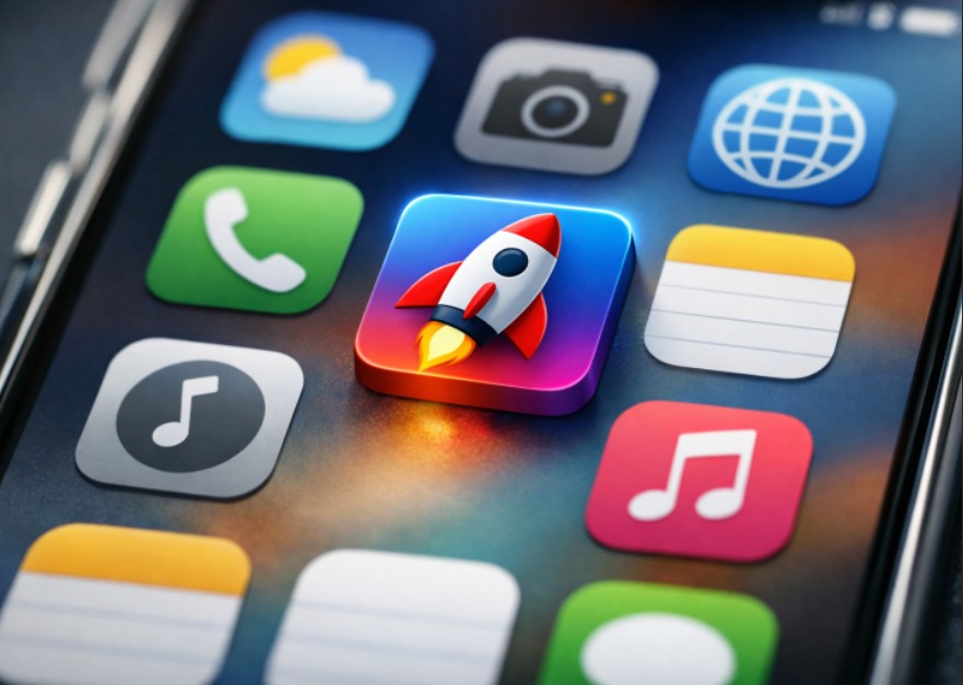
A great icon is clear and memorable at just a glance. Simplicity is key, especially since app icons are often displayed at very small sizes. Avoid clutter and stick to a single, powerful element or symbol in your design. Use a limited color palette to keep visuals strong and focused. Iconic examples like the Twitter bird or Snapchat ghost rely on one clear shape, which stands out even when scaled down. According to Smashing Magazine, focusing on a central element ensures higher recognizability and appeal.
Adhere to Platform-Specific Guidelines
Both iOS and Android have specific icon design requirements. Apple recommends a 1024×1024 pixel icon, with a simple layered design and no transparency. Google’s Material Design approach uses adaptive icons that change shape across devices and maintain visual integrity. Non-compliance can result in distorted or low-quality icons, which might hurt your app’s visibility and ratings. It is important to study official documentation like the Apple Human Interface Guidelines and Google’s Material Design guidelines before finalizing your icon.
Utilize Color Psychology
Color choices go beyond aesthetics. They influence how users feel about your app and whether they associate it with reliability, innovation, or fun. For example, blue often signals trust and professionalism—making it a top pick for finance and healthcare apps, while red grabs attention, used frequently in entertainment and social platforms. Green indicates health or growth, matching eco-friendly or wellness apps. Research shows users make subconscious judgments about apps in mere seconds, so your color palette needs to support your app’s personality and purpose. Additionally, consider cultural differences when selecting colors for your app icon, especially if you are targeting a global audience. Certain colors may carry different connotations depending on regional or cultural contexts. For instance, while white might symbolize simplicity and cleanliness in Western cultures, it can represent mourning in parts of Asia. Taking the time to understand the psychological impact and cultural meaning of your chosen colors can give your app a more universal appeal and prevent miscommunication or alienation of target users.
Test Across Various Sizes
An icon might look stunning at full resolution, but will it be equally clear as a tiny phone icon? It is crucial to test at all common sizes, like 1024×1024, 120×120, and especially 60×60 pixels. Make sure no details are lost and the icon remains identifiable. When in doubt, err on the side of simplicity because overly detailed designs become muddy or indistinct at small scales.
Testing should extend beyond just shrinking the design. Simulate real-world conditions by previewing the icon on a range of device backgrounds and home screens, both light and dark. Consider how the icon looks alongside competitors, and solicit feedback from real users to catch issues you might have missed. Making adjustments based on usability feedback early in the design process can increase the likelihood that your app attracts new users once it hits the market.
Maintain Consistency with Brand Identity
An app icon is often many users’ first and most frequent visual interaction with your brand. It should align with your overall branding, using consistent color schemes, fonts, and graphic styles found in your other assets. A unified look strengthens brand recognition and builds trust over time. For new apps, a distinctive, cohesive icon can create a vital early impression that keeps users coming back. For more on brand consistency and icon design, you can explore Creative Bloq’s app icon insights. Beyond simple color matching or logo adaptation, think about how your app icon can visually tell your brand’s story. Incorporate subtle design cues, motifs, or patterns unique to your company or its mission to further cement association in user minds. The more your icon feels like a coherent extension of your brand, the easier it will be for users to recall and recommend your app.
Stay Updated with Design Trends
Design trends shift regularly as user preferences and devices evolve. Bold gradients, minimalistic flat styles, and playful three-dimensional effects have seen widespread adoption in recent years. Updating your icon design as trends shift sends a signal to users that your app is active and current. Regularly reviewing the top apps in your category will help you spot design patterns that resonate with your audience. While it’s important to remain aware of current trends, avoid overcommitting to fleeting fads that may quickly fall out of fashion. Strive for a balance between classic design principles and modern aesthetics. An icon with timeless appeal will have longevity, while subtle updates can keep it feeling fresh. Always keep your target audience in mind when iterating on the design, observe their preferences, and how their engagement shifts as design standards evolve.
Conclusion
The right mobile app icon does more than capture attention. It increases downloads, builds user confidence, and enhances brand recognition—all with a single, small graphic. Focus on simplicity, follow the best practices outlined by platforms, use color intentionally, test thoroughly, keep your brand identity in mind, and periodically refresh your design to match trends. Mastering these key principles puts your app on the path to greater visibility and long-term success. Ultimately, the app marketplace is ever-evolving, and your icon must evolve with it. Continually analyze your icon’s performance, leveraging analytics, user reviews, and A/B testing if possible. Even seemingly minor tweaks, such as updated colors, a refreshed silhouette, or a more balanced composition, can have a measurable effect on user engagement and downloads. Finally, remember that your icon is a living part of your product experience, deserving as much care, attention, and creative energy as any other major aspect of your app’s design or development.